The following tips in this blog will help you optimize your AdSense ad layout to increase earnings. Read the blog to get more information.
Every publisher wants to improve the performance of their AdSense campaigns. Google AdSense is the most widely used PPC network out there, and with a little bit of tweaking, it’s possible to see a good revenue uplift.
Here are a few tips to help you optimize your AdSense ad layout to set it up for higher earnings.
1. Experiment More With the A/B Testing Feature
AdSense gives an ‘experiment’ feature, you should use it.
If you want to know whether your ad will generate more clicks for text-only or text-and-image, you can test both the choices over a specific period of time.
You could also test other factors like the color of the text or the size of the ad unit to measure the results.
Keep experimenting and use the results to optimize your ads until you have the winning formula!
(Remember: As important as it may be, manual testing can be cumbersome, which is why we built an automated ad optimization tool for it that does it on autopilot.)
2. Better Content Equals to Better Ad Targeting
AdSense uses a contextual targeting system to serve ads, which means that its ad serving algorithm processes your content and then delivers ads that are best matched to it.
This obviously means that if the content you’re posting is either too little or otherwise lacking in quality, the targeting will be weaker—thereby affecting ad performance.
Here’s some advice from the AdSense team on the subject:
Ensure that your pages are full of compelling content. The more targeted, text-based information you provide to our crawler, the easier it will be for our system to determine what your pages are about, and the greater the relevance of the Google ads will be. This enhances the effectiveness of the AdSense program, resulting in a better experience for your users, not to mention for the advertisers appearing on your pages.
3. Ad Sizes Matter — A Lot!
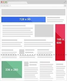
If someone told you that ad size is not an important factor, they are wrong. It’s one of the 3 or 4 most important ones.
Some ad sizes are more effective than others. They drive higher engagement and it pays to find out what sizes best suits your niche.
The following 3 sizes are the most effective for targeting desktop traffic:
- 728 x 90
- 336 x 280
- 300 x 250
It has also be noted that 320 x 50 and 300 x 250 are generally good for targeting mobile traffic.
Studies show that these ad sizes provide the optimal chances for generating clicks, so you can go with these if you’re pressed for time—as long as you also understand that this is no replacement for actual testing.
4. Follow AdSense Heatmap
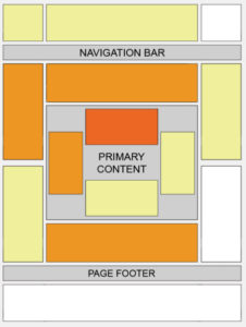
The AdSense heatmap gives you the ideal ads position based on the website’s template.
So make sure you use it to determine the best positions for your ads.
Dark red areas show the best areas for your ads, followed by orange area and yellow.
Experiment by placing ads in the “hot” zones. The more you can stick to them, the better returns you can expect in terms of the clicks.
5. Choose the Right Ad Types
Some publishers prefer text ads while others like to have multimedia ads. You should use the right mix of both to optimize your revenue. Experiment and find out what works best on different sites—there is no “one size fits all” here.
6. Don’t Ignore Mobile Ads
Many businesses still ignore the importance of mobile traffic. It’s growing at a very high rate and you cannot afford to ignore the revenue uplift you can generate if you optimize your ad setup for mobile devices.
Also, don’t forget to use the anchor tool—it allows you to keep your ad anchored to the screen’s bottom. The ad will remain there even when the visitors scroll down the screen. It will help increase your ad’s exposure.
7. Place Ads Below the Fold Ads Too
There is a general focus on getting the ads above the fold. But you shouldn’t forget to take advantage of the below the fold positions. The featured content widget is highly successful and features below the fold.
How you implement these ads will be based on what style is required on the site. Many use the 300×250 ad size effectively at the bottom of the webpage.
However, as with most things—you should choose the size and style after experimenting and finding what works best for you. When optimization ads, there’s really no substitute for testing.
This is guest contribution by Adam, a small business consultant with more than a decade of experience at the Calgary Web Design Firm.
FAQs
It takes 4-6 weeks for Google Shopping Ads to be properly optimized, and they need to be managed continually to adjust for individualized keywords.
Advertising is not only about creative taglines and colors, but also the size of the ad. The size of the ad that you promote is also important if you want to drive strong results from the marketing campaign.
Two or more versions of a variable (web page, page element, etc.) are presented at the same time to different segments of website visitors to determine which version leaves the greatest impact and drives business metrics, also called A/B testing or split testing.
A growth blog for professional bloggers and ad ops professionals.




1 Comment
I’ve found that Adsense can be pretty easy to set up and use. You just have to have good content and a lot of traffic for it to work!