As we’ve previously covered, one of the most common policy violations committed by publishers on AdSense is placing the 300×250 ad unit above-the-fold on mobile.
The reasoning for this policy was simple: Since mobile screens are small, square ad units or vertical ad banners push the content below-the-fold, i.e., beneath the part of the screen that a user sees before scrolling; thereby damaging user experience and creating higher incidences of accidental clicks. This is the policy as stated in Google AdSense documentation:
Publishers should ensure that their mobile site layouts do not cause ads to push the page content below the fold. For this reason, we don’t allow 300×250 ad units (or larger) above the fold on mobile as this layout requires the user to scroll down to view site content. To ensure a good user experience, the site content should be clear and accessible above the fold. We would therefore encourage publishers to implement smaller ad units for above the fold placements on mobile site.
Last week, Google announced in a blog post that this policy will no longer be in effect and publishers are now free to place the 300×250 unit above-the-fold on mobile.
At Google, our policy teams are constantly looking for ways to improve the experience for everyone in the mobile digital advertising ecosystem – users, advertisers and publishers. Part of this involves listening to our mobile publishers concerns. One such concern that we are addressing in this policy update involves the limitations we’ve previously placed on 300×250 sized ad units.
We recognize the frustration around limitations we’ve placed on this sized unit on mobile webpages, and starting May 2, 2017 we will no longer disallow this ad unit from being placed above the fold on mobile web pages. After careful review, we’ve determined that when 300×250 ads are implemented above the fold in a user-friendly way, the ads do not annoy, distract, or result in ad performance issues.
Sarah Perez at TechCrunch has noted that this is patently absurd reasoning on Google’s part since the very reason cited for the previous limitation was that it is not user-friendly. So what has changed now? One of the things that has tangibly changed is that phone screens have gotten much bigger and more high-resolution over the last year or two, as they do — so the 300×250 unit will just not take as much space on newer models such as Google’s Pixel, for instance, as it would have on older devices.
Google has been intently moving towards creating programs and policies that address longstanding issues in the web publishing industry, starting with AMP, removing last-look privilege in DFP, launching new native ad formats, and now this policy reversal.
Want to know more about AMP? Click here
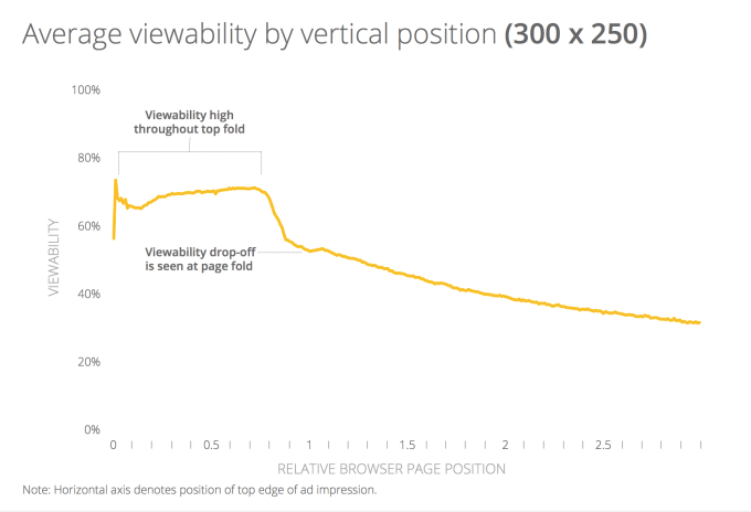
According to Google’s own research, placing the ad below-the-fold is correlated with a sharp dive in CPMs.

It’s pretty clear why Google would do this: First, it will make publishers happy, many of whom are disgruntled with low CTRs and CPMs. Second, perhaps more importantly, Google makes most of its money from ads, while their focus is and always has been on user experience — at a scale as huge as this, it becomes a matter of tradeoffs.
Of course, this won’t make the advertisers happy, and while the users may not get together and march against it, no one’s going to be particularly thrilled to see an ad first thing when the page loads. But again, this is essentially a publisher-first move, and Google has advised caution while making the ad placements to make sure that the content area is clearly demarcated.

Shubham is a digital marketer with rich experience working in the advertisement technology industry. He has vast experience in the programmatic industry, driving business strategy and scaling functions including but not limited to growth and marketing, Operations, process optimization, and Sales.


