UX design plays a vital role in effective web design. User Experience design is a part of the web design process that improves usability and ensures that the users are satisfied with the overall design of the website. It is good to know all the UI/UX terms so you can better avoid these mistakes.
From Wikipedia:
User experience design (UXD, UED or XD) is the process of enhancing user satisfaction by improving the usability, accessibility, and pleasure provided in the interaction between the user and the product…
Your product or service might be the best in your industry, but if your website UX is below standard, then you will experience a high bounce rate as well as poor conversion rate.
In this post, I will explain 9 worst UX mistakes that every designer should avoid vigilantly. Let’s get started!
1. Focusing More on Background Image Instead of Content
Using a full background image is a popular trend in the web design industry. But, some website owners don’t understand the concept of using background image to highlight the content above the fold and draw attention.
There are many websites I came across where my eyes instantly go to the background image, but I did not find any content above the fold and I had to scroll down to get the information about the websites.
These websites clearly failed to use the effectiveness of background image.
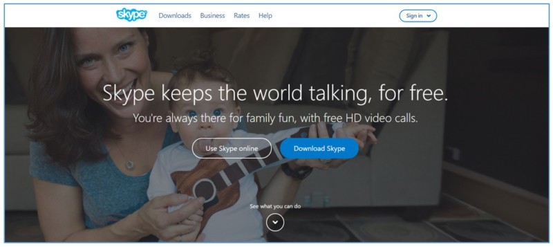
A perfect background should not grab too much attention. Instead, the main title and the text of the website should grab the attention. Let me show you a perfect example from Skype and their website has the right balance between the content and visual effect.
2. Too Many Form Fields
Another common mistake tons of websites make is by keeping too many fields into the forms. Whether you use the form to sign up or to contact with you, nobody likes filling out long forms. Having too many fields into the forms can kill your website conversions.
Therefore, when designing the forms add only the most important fields that are really necessary. Eliminating unnecessary fields can significantly boost your conversion rate.
Don’t trust my words?
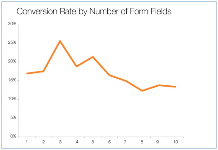
Dan Zarrela at Hubspot analyzed over 40,000 of their customers and revealed that conversion rate improves by almost half, when the number of form fields is reduced from four to three.
3. Having Too Much Text
Chartbeat found 55% website visitors spend less than 15 seconds on a webpage. The majority of the web visitors just glance through the bullet points and bold texts rather than reading long paragraphs.
If you add too much text on your website, most of the people won’t bother to read a big chunk of text. So, here less is more as long as your content can convey the required message to the audience.
People like visuals and they are much more engaged with visuals. When designing keep in mind not to overload the page with too much text and offer some visual contents like attention grabbing images, video clippings and infographics.
Let me share a quote from Hubspot blog I recently came across:
90% of information transmitted to the brain is visual, and visuals are processed 60,000X faster in the brain than text.
4. Not Being Responsive
Responsiveness allows websites to change layouts according to the visitor’s screen resolution, whether on a smart phone, tablet or desktop. It ensures that a website looks perfect from all device.
Nowadays, so many people are browsing websites from mobile phones and tablets.
The number of people using mobile devices outstripped people on desktop computers in 2014. – Jim Edwards, Business Insider , April 2014.
If your website is not responsive, then people will find your website broken, and they will leave your site with bad user experience.
Therefore, you need to make sure that your website is responsive so that people can use it irrespective of the devices they use.
5. Lack of Breathing Space
Another major mistake designers make is placing too many elements in a single page. Having too many elements in a single page means more elements competing to draw attention.
The best solution is keeping some breathing space highlighting something important like your call to action button, form or product image, etc. Having plenty of breathing space or white space in your website guides your audience attention to the most important components.
If you don’t leave enough white space, then your potential audience may miss the most valuable information.
When a website strikes the right balance of breathing space, it’s much easier for the visitors to process with it.
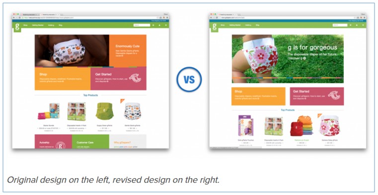
GDiapers improved their conversion rate by nearly 20% just by adding some white space.
6. Low Contrast
Low contrast has become a trend these days, but if can’t do that properly, you can have severe issues. Having low contrast in a website can make it harder for the visitors to read the content.
Therefore, you should not use low color contrast in the main body of a text as this will make text very hard to read for some of your users. In main text, the contrast should be optimum.
If you still want to go with the low contrast, then choose the font wisely so that your visitors can read your content easily.
Let me show you an example with low contrast.

Hard to read, isn’t it?
7. Slow Page Loading Speed
Majority of the web visitors expect to load a page within three to four seconds. If a webpage takes more than of that to load, it means that the visitors are having the bad user experience.
A delay in loading product description and images or slow checkout process leads to huge bounce rate.
Aberdeen Group study found that one second delay in page load time equals 11% less page views, 16% decrease in customer satisfaction, and 7% less conversions.
Moreover, slow loading speed makes negative impact on search engine ranking.
So, to offer better user experience you need to make sure that your loading speed is less than 3 seconds. Here are few tips you can follow for faster loading:
- Optimize your images
- Reduce redirects
- Don’t use too many plugins
- Minimize HTTP Requests
- Reduce server response time
8. No Clear Call to Action (CTA) Button
Every website has a particular goal, and if you have a website I am sure you have a particular goal too.
Whether you want your visitors to sign up, make a purchase, request a quote, or simply call you and it’s important to let your audience know what you want them to do.
Your CTA button is what tells the visitors what action they should take in your website.
I came across many websites with no clear call to action button.
Let me share one with you.
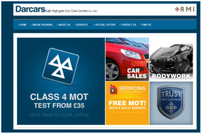
This website has no clear call to action. There is a weak one “click here to book online”, which can easily be overlooked.
Your CTA button should stand out from the rest of the page and make it easy for the visitors to take your desired action.
9. Creating a Visual Clutter with Lot of Fonts and Colors
A perfect design is not about using a variety of fonts and colors. The perfect blend of colors and fonts make a website appealing. Some designers use too many fonts and colors while designing a website which actually makes a website clutter.
As a role of thumb, you should not use more than three colors in your design scheme and use only one or two consistent font throughout the website. Never use too stylistic fonts that make tough for quick at-a-glance reading.
Final Thoughts
Improving UX is a continuous process that can only be achieved with regular research, following the best UX tips and testing. I hope these nine mistakes outlined above will help you make more user-friendly websites.
Feel free to start a conversation below. I would love to read about your points of view, suggestions on how to make things better
This is a guest contribution by Jabed Hasan, Content Marketing Manager at Mountnow. He is passionate about writing and love to write on SEO, CRO, Growth Hacking and Online Marketing Strategies. You can follow him on Twitter and LinkedIn.

Shubham is a digital marketer with rich experience working in the advertisement technology industry. He has vast experience in the programmatic industry, driving business strategy and scaling functions including but not limited to growth and marketing, Operations, process optimization, and Sales.


