When monetizing your website using Google AdSense, the obvious goal is to have the best click through rate (CTR) possible, without breaking any program policies. As a webmaster, you owe it to yourself to make sure this happens. One of the most effective ways to make sure you’re seeing the highest CTR possible for your website, is to use split testing for your AdSense ads. Now I know that may sound a little complicated, but it’s something which everyone can do and quite easily.
What is AdSense Split Testing and What Can It Do for Me?
To get started, let me explain to you what split testing is. Split Testing is the process of creating multiple variations of an existing web page to improve your conversions. Conversion can be anything from Newsletter signup to increasing your sales. So, to split test a web page, you need to create multiple versions of the page and each with some variation. Why the variations? To test which layout best converts visitors into actions. Now, split testing can be used to improve your Adsense click through rate too. Although split testing can also compare the effect of different ad sizes as well as ad locations on your CTR, in this article, we will first focus on using split testing to improve the effectiveness of different adsense color themes, keeping all other ad properties constant. By doing this, you can see which version gets more clicks and hence more revenue.

AdSense Ad Units and Styles
If you’ve used AdSense before, I’m sure you’re aware of the tremendous amount of ad variations, which can be created. You have the option of choosing different colors for your ad unit borders, titles, background, URL and a lot more. So Split testing can help you decide which Ads get the most clicks. However, before I explain how to split test your AdSense ads, I’d like to talk a little bit about AdSense ad design.
You want your ads to be noticeable, in a way, so that they get more clicks for you without hindering with the user experience. You want them to look natural – like they’re supposed to be there. AdSense ads can either blend into your website design, they can complement it, or provide some contrast.
When blending your AdSense ads, you can make the borders and background of your ad the same colour as the background of your website or page. To create an ad that complements your page, use an ad background color which matches a color that already appears on the web page. For example, if the background of your sidebar is blue, your compliment-style ad could have a matching blue background. Lastly, your AdSense ads can contrast your webpage. When contrasting an ad, you actually don’t want to match the background at all. If you have a black background, you could create an ad with a white background to contrast. Alternatively, if you have a white background, you can create an ad with a black background.
What will work best? Only Split Testing can tell.
Now that we’ve discussed AdSense backgrounds, let’s go over text color and link text. You could try creating a variation which matches your text color and link color to the rest of your website. For example, if the text on your website is charcoal gray, make your ad text charcoal gray. If your link text is midnight blue, do the same to the link text on your ad.
There is also the decision on whether to use text ads, image ads, or a combination of both. Instead of using a combination of Text as well as Image ads (which google suggests), you should split test what works best to increase your CTR and eCPM. Keith Lock from Webmaster.net talks about the small tweak he made with his AdSense ads. Keith displayed a recommended ad unit size on one of his pages – the 728×90 Leaderboard just under the main heading.
Keith meant to display the ad as text only, but mistakenly had it set to display both image and text ads. He couldn’t figure out why he was only earning $8/day, when his other pages with AdSense ads were raking in $48/day.
Once the attention was drawn to the fact that his ad was displaying both text and images, he then changed his ad to display text ads only. By doing this, his earnings increased by a whopping 475% to $46/day!
In contrast, Mitz Pantic from Famousbloggers.net talks about which tweaks found her success with AdSense ads. She received an email from Google recommending that she switch her 728×90 Leaderboard ad (same size as Keith’s) to display both text and image ads. She obliged and to her surprise she saw a CTR increase of 15%!
This just goes to show, that when monetizing with AdSense, there are not fixed rules. Every website is different and what works for someone, won’t necessarily work for you. Media or fashion sites might have more success with image ads, whereas informational sites might see better results with text ads. In fact, different segment of visitors on your website may respond differently to the same ads on a website.

How to Easily Split Test Your AdSense Ads
The only way to discover which color theme is best for you, is to perform split testing on your AdSense ads. To split test your AdSense ads, you must test all desired situations at the same time.
Now, to perform these tests, also known as A/B testing, there are many themes, plugins and apps that can help you. The problem with these themes and plugins however is that:
- They work using simple javascripts (no cookies) and hence a single user might be shown your other variation after a page refresh, which skews up the statistics.
- These themes can’t create Ad Variations in your Adsense Account, hence you have to create the variations under each channel and enter the ad code in the themes. For a normal website which has 3 ad units on a page; to test and compare 6 types of color themes, image vs text ads, 3 different ad locations for each unit, you’d have to create 100+ Variations, definitely not an easy task!
- These themes can’t track ad links, hence you have to see your Adsense Account to see the results.
- These themes don’t use multi-arm bandit algorithms to distribute traffic, which means even your worst performing variation will get the same traffic as the best performer and if banner blindness develops around your ads, after a certain time, it won’t automatically detect it.
So, We’d recommend you use an Ad Revenue Optimization tool (DISCLAIMER: AdPushup is an Ad Revenue Optimization Tool), which automatically creates variations for your ad units and uses advanced algorithms to optimize performance.
What Split Testing Shows Us
Popular blogger Darren Rowse from Problogger.com often performs split testing. He was kind enough to share some of his results on his blog. He found that his left-aligned ad received a CTR that was 66% higher than its right-aligned competitor. This is an interesting result and it makes me wonder if the fact that we read left to right was a contributing factor.

Darren also compared text and image banner ads in the upper right hand corner of a page. What he found with this test is very interesting. When he switched from the image ad to the text ad (which had an appropriate colour scheme) his CTR went down by 0.02%, however it appeared that the cost-per-click (CPC) went up, which ultimately earned him more money.
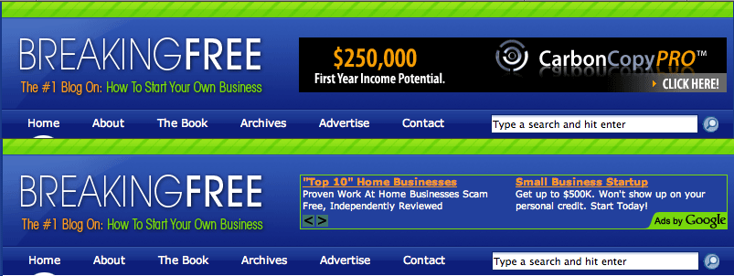
Conducting further tests on image vs. text ads, Darren placed the ads underneath posts as well on the homepage, just under the excerpts. Again, the CTR went down when he switched from image ads to text ads, but it again appeared as though the CPC went up, helping improve the eCPM.
Given the results seen from Keith’s experiment with text vs. image ads, it appears as though text ads do perform better. However, this really does depend on your site and the content it provides, which is why you need to conduct your own A/B tests. Another item to point out regarding Darren’s study, is that his first test, the one where he experimented with a left-aligned ad and a right-aligned ad – that was an image ad and it had the highest earnings of any ad included in the study that he posted on his blog.
Give It a Try: Anyone Can Do This
There are endless amounts of ad variations which can be created and you will never know which ads work the best on your site until you try your hand at split testing your ads. I guarantee that if you’re not split testing your AdSense ads, then you’re not seeing the best results you can accomplish with AdSense.
If you’re looking to make more money from your websites – whether you’re a webmaster, publisher, content provider, someone looking to monetize their blog – you owe it to yourself to start split testing your AdSense ads today and witness the potential earnings you can achieve.
Ankit is a co-founder @ AdPushup (a tool which helps online publishers optimize ad revenues) and loves online marketing & growth hacking.
