People who run blogs on the internet typically want either of three things:
- They want to share their thoughts with other people.
- They want to promote a certain business venture through content marketing.
- They want to use their blog as a direct income source through on site advertisements.
It has been proven that all three of these interests are met much more efficiently when people know the right way to present their ideas. Below you will find seven tips that will inevitably increase the number of your blog subscribers. Make your posts reach further and touch more people’s lives.
#1 Offer Exclusive Content
Exclusive content can mean a lot of things, and can be offered in various ways. If, for instance, your blog offers movie reviews, then coming up with exclusive content in the form of early trailers, exclusive interviews and exclusive trivia on your blog that other websites do not offer will drive more visitors.
In order to increase your blog subscribers, you would keep some of your exclusive content available only to those who subscribe. Also, it’s important to let people know, like we’re doing on our blog. A small statement like “Exclusive Content sent only to subscribers” near the subscribe box can do wonders.
The relationship between exclusive content and rise in the number of subscribers has been elaborately proven by Chris Spooner, the owner of BlogSpoonGraphics, who recorded that his subscriber count increased from 10 to 100 subscribers in a day upon introducing a bundle of design resources as a free giveaway.
#2 A/B Test the Blog Subscribe button
Always remember that the primary idea that contributes to having a successful blog on the internet is to generate loyal readers who are eager to read your content. In order to get this done, it often helps when you choose your words in a way that allures people the most into subscribing to your blog.
As an example, Chris Spooner (from above) also came up with a staggering result when, instead of keeping the subscribe button of his blog which read “Get Email Updates”, changed it to, “Download Now” during his offering of the free design gift pack while simultaneously justifying the button name saying that blog subscribers automatically get the pack emailed to them. He proceeded to do a split test containing forty thousand impressions, and discovered that the “Download Now” button received thrice as many hits as “Get Email Updates”.
As another example, Willy Franzen, came up with a similar test when he changed his subscribe button to “Get Jobs by Email” from “Subscribe by Email”. He experienced an increase in subscription rate of a staggering 254% upon the change, and most of these new blog subscribers decided to accept emails from him.
To cite another example Matthew Woodward changed the color of a button which increased his profits by 20%. The simple colour change resulted in an extra 850 affiliate clicks during the course of a month.
#3 Make Your Visitors Stay Longer
Successful blogs have low bounce rates. So how do we lower our bounce rates? There have been detailed studies like this one that answers why visitors leave a blog?
Cameron Chapman, at the Kissmetrics Blog, saw through the matter and came up with something that lowered his bounce rates to a mighty 2%. Having a lower bounce rate means, more page views per visitor and this would ideally make the action of subscribing more likely.
The first tip would be to make the navigation simple and help users find things easily. An uncluttered design like at Copyblogger (or even ours at Adpushup) works great.
#4 Use Lightbox based Popups
A blogger’s natural reaction to such a venture would be to immediately think of what it might mean to the bounce rate and say, “No!” But social media scientist Dan Zarrella collects some stats about it and they tell a different story.
When using a popup to get the visitors’ email address, he found that the subscription rate of a certain blog increased to over three per cent from the initial one per cent. If you still think a simple subscription box on the sidebar of your blog will suffice, then think again.
One can argue that by using such popups the bounce rate could increase and the overall user experience will be affected – So, what one can do here is that instead of showing the popup after a certain time delay or on page load, it can be triggered when the user decides to exit the blog (exit intent). We plan on doing the same on our blog too.
#5 Make Your Blog Faster
With the advent of superfast internet, people are getting more and more indignant when it comes to waiting for websites to load. Sean Work, again from Kissmetrics, delved into the possibilities and came up with a bunch of info graphic plots that showed that a single second of delay in your blog loading makes up for seven per cent of people abandoning your blog and going to another website.
Similarly, you lose forty per cent or more of your viewers (Sean’s infographic) if your website takes more than three seconds to load. We all know blog readers do not like to wait, but who would have thought slow speed was that finely related to blog abandonments! Following are a few ways in which you can get your blog to be faster.
- Optimize your images: You can optimize your images using the guide here or host your images on third party apps like Flickr etc. This would reduce the load on the server.
- Optimize Javascript: Java Script normally won’t let you load anything else on the website until it loads. It is advisable to keep javascript at the bottom to make the site load faster.
- Using a CDN is another good idea, they are cheap. You can read more tips here.
Slow websites, including blogs, are common in the internet these days, with a statistic showing that seventy three per cent of mobile internet users (Sean’s infographic) have come across websites that were too slow to load. Ensure that your website isn’t one of them.
#6 Have More Places to Subscribe
We’ve already mentioned that you can use an exit intent based popup in order to get new visitors to enter their email. However, understand that those who are visiting your blog for the first time have probably not read any of your content before, and would have greater chances of cancelling the whole thing rather than signing up. You can place sign up forms in much more strategic locations across your blog so that people do not have to look places to sign up when they feel like it.
One of the first places where you ought to have a blog subscribe box is the sidebar of your blog. This is a good idea, as the side bar remains visible and in close proximity even when individual blog posts are being read. Hence, it becomes easier for people to subscribe. However, it is often possible that people do not notice your sidebar subscription box, to that end, Chris Spooner (again!) has a few concepts to put forward.

Spooner strategically puts sign in boxes at the ends of his blog posts (like we do as well). This is a brilliant idea as if a new user has come across your blog and read a post all the way to the end, then they are much more likely to subscribe than someone who hasn’t read much of you, aren’t they? Another way you can increase your subscribers is by attaching a sign in box to you About Me page. That can work wonders, as people who are reading about you and your blog are likely to have developed a detailed interest in what you do. Hence, they are much, much more likely to subscribe to you.
#7 Increase subscription rates by removing unnecessary fields
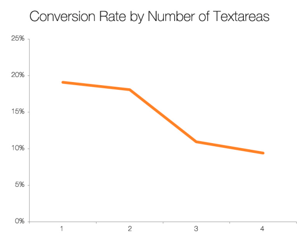
 What you see in the image on the right is the perfect example of an unnecessary field. People will spend the least amount of energy possible to scour for information on a website. Adding just one more field like the last name, which by the way you don’t use in correspondence can reduce the opt in rate drastically.
Roughly half of the people who want to subscribe won’t do that because of this additional field.
Dan Zarrella’s research with 40000 forms on Hubspot proves this fact.

Thus concludes our list of seven useful tips that would get you more subscribers and business in no time. But always remember that the goal of efficient blogging is to get write great content which readers value.
Ankit is a co-founder @ AdPushup (a tool which helps online publishers optimize ad revenues) and loves online marketing & growth hacking.


